Consistency is not identical artwork
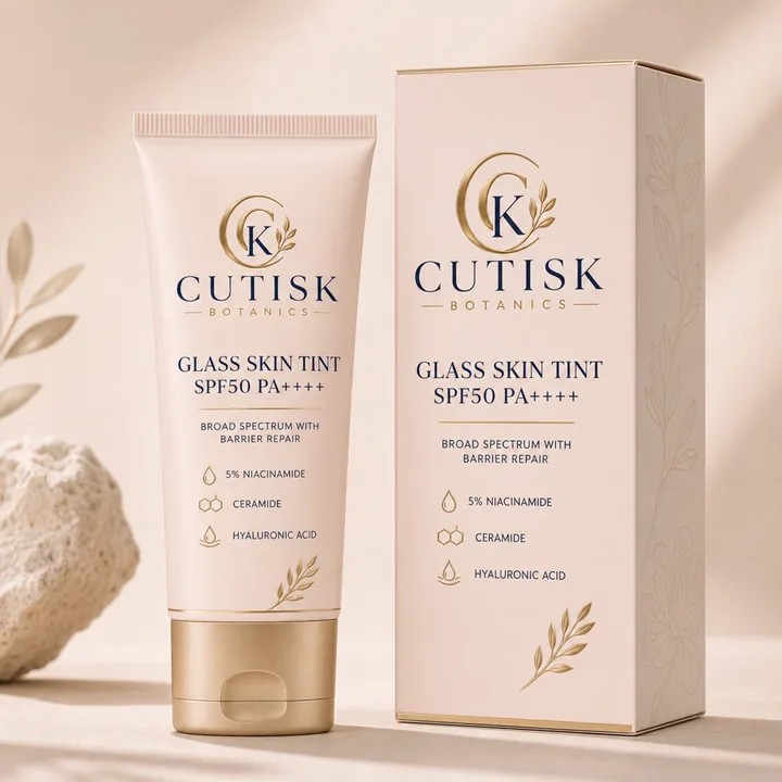
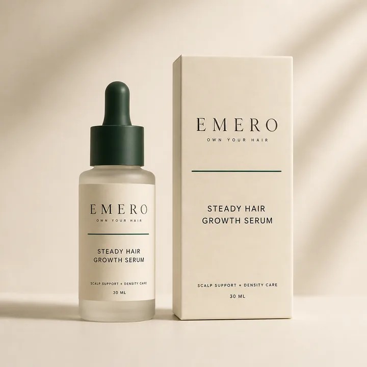
A bottle and its outer carton have different jobs. The carton may introduce the product on a shelf; the bottle stays in use after the carton is gone. Keep a few strong identifiers across both—name, colour relationship and typography—while allowing the layout to respond to the surface.
Choose what survives unboxing
Imagine the carton has been discarded. Does the bottle still say what it is and which variant it contains? Put the lasting identifiers on the object people keep. Supporting narrative can live on the larger carton panels, where there is room to read it without turning the bottle repeatedly.
Treat the wrap as a curved surface
A rectangular label becomes a changing field of view when it wraps around a bottle. Keep the primary message in the most readable front area and check where the edges meet. A long line that looks elegant flat may disappear around the curve. Inspect a bottle mockup in CraftyWand from several angles before finalising the type.
Compare the pair at the same scale
Place the bottle and carton references side by side at their intended proportions. Do the brand marks feel related? Does one overpower the other? Use the mockups to review visual balance, then confirm the exact label dimensions and application tolerances with the supplier. A similar-looking bottle is not proof of a production match.
Build a range rule before the second variant
Choose which elements stay fixed and which change for the next scent, shade or formula. Test the longest likely product name now. A layout that only fits the first short name is not yet a system. Save the approved direction and use it as the reference for future variants.
Put the idea to work.
Choose a model, bring your own artwork and start building in CraftyWand.
Open CraftyWand free ↗Useful starting points
CraftyWand: current tools and free account access · Dieline library · Pacdora: current plans and features